
Tag Archives: vistaprint

Vistaprint Postcards Review: Check Out My Postcards!

Vistaprint Postcards – My Real Review + Today’s Best Coupon: If you are looking to use postcards as part of your marketing strategy, you might want to consider Vistaprint. They have some of the best pricing & highest quality custom postcards, and when you use a coupon you save significantly more.

Vistaprint Flyers | Reviews, Flyer Marketing Ideas + Coupon

Inexpensive Custom Flyers from Vistaprint: Marketing flyers are like the infantry of the marketing world; simply getting the job done without glamour.
Whether you’re advertising a coupon for your beauty salon, an upcoming concert, or letting the neighborhood know about a new house for sale, flyers can get the job done.

Vistaprint Posters: My Real Review + Coupon

Vistaprint Posters Coupon + Review: So, a lot of the reviews out there were written in haste by people who never used Vistaprint, but will make a buck if you click on their site. I decided to put my money where my mouth is and have a poster design printed through Vistaprint, and share the results.

Vistaprint Bad Reviews | Top 10 Customer Complaints
That’s with good reason. As a printing services provider for small businesses, Vistaprint has seen some explosive growth in recent years. They may have started their business giving away business cards for free, but that early altruism has yielded $289.9 million in revenue from printed materials in 2016.
When you move that much product, problems are bound to pop up. Even though Vistaprint offers design templates for each of its products, problems and mistakes still occur. (Just don’t complain about the price, because we can save you 50% here!)
First, Most Reviews for Vistaprint Are Positive
Before we talk about things that went wrong in customer reviews for Vistaprint, we have to mention that most reviews are positive. Also, many complaints, (like slow shipping or low-resolution images) could have been avoided by properly using the free design templates and by checking their shipping speeds.
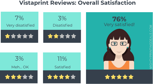
Even though most Vistaprint customers write positive reviews, about 14% are negative. Because they process thousands of orders each day, that’s a lot of bad reviews! Let’s find out what customers complain about, and maybe it will help you with your own order.
Top 10 Vistaprint Complaints:
Here are the top 10 Vistaprint customer complaints from bad reviews, and how to avoid them yourself.
1. My Business Cards Aren’t Legible:
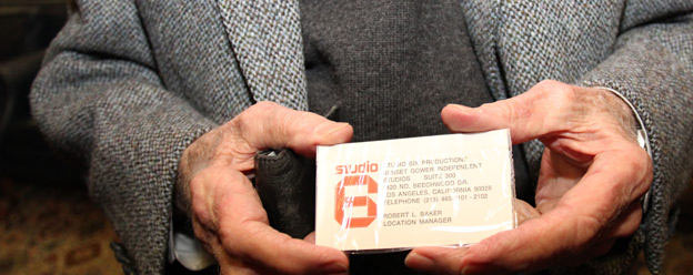
Customer review: “The business cards I received were of such poor resolution that my contact information was not legible.” – Matan of Santa Ana, CA
Imagine you put a lot of work into designing the perfect business card. You place your order and wait for a preview to arrive–only to realize you can’t read it!
This is one of the most common Vistaprint complaints out there. That’s because people don’t always consider how a design will look on a 3.5-inch-by-2-inch card.
If you have small type in your logo, for example, keep that in mind when you scale it. It’s better to showcase something a little too big than something too small.
You’ll also want to make sure you go with white paper stock, unless you have planned ahead for what your design will look like printed on darker paper, like their brown Kraft paper stock.
This complaint is most common with customers who upload their own designs, so make sure your image is 300+ dpi and the text is clear!
2. My Colors Don’t Look How They Looked Online:
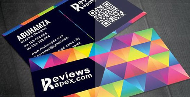
Color is one of the hardest things to visualize in the printing world. That’s because your computer doesn’t mix colors the same way ink does during a printing job.
On-screen, your colors are in RGB. They’re made up of light-emitting pixels of red (R), green (G), and blue (B) mixed up in different amounts.
In the printing world, colors are in CMYK. Printers create each hue by overlaying dots of cyan (C), magenta (M), yellow (Y), and black (K).
Some colors look roughly the same across RGB and CMYK, but light blue, green, and orange can change dramatically.
For the best results, use an online color converter to get the CMYK values you want. Make sure your final design is in CMYK, not RGB.
3. My Border Is Off-Center
Customer review: “Whoever stretched the canvas over the frame did not center them and it looked like a 3 year old did the work!” – John of New Castle PA
This is a common problem with custom designs. If your design goes all the way to the edge of the paper, you’ll need to design with bleeds to get it spaced right.
Most printers will include measurements for the bleed, trim, and margin. You need to meet these for your product to print correctly.
Here’s a quick primer:
- Bleed is how far your design should extend off the page. You won’t see this in your final product.
- Trim is where the printer will cut your design. Anything outside of the trim line will be cut off.
- Margin is the safe zone. All of your important elements need to be inside the margin.
It seems that a number of negative reviews could have been prevented if the customers had properly used the free design templates provided for each product.
4. The Paper Is Too Flimsy for What I Need:

Customer complaint: “The quality of the invitations was very cheap! Thin floppy paper was of the worst quality!” – Margaret of Tacoma, WA

Vistaprint Free Sample Kit: Business Cards, Postcards, Brochure

Free stuff from Vistaprint for your business – If you’re a small business considering printing marketing materials, it might help to get samples in your hands before putting together an order. In fact, a number of online printing services offer free samples, including Vistaprint.
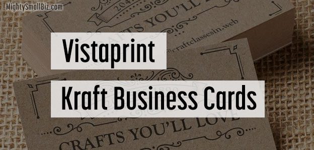
Vistaprint Business Cards: Recycled ‘Kraft’ Premium Paper (New!)
Kraft business cards are eco-friendly, and printed on uncoated, light brown, 90% recycled paper.
Kraft is a paper option under Premium Business Cards, and there are dozens of vintage-looking design options to choose from.
Kraft business cards

Vistaprint Business Cards: Metallic Finish & Spot Gloss • (So Shiny!)
“Shiny! Like a treasure from a sunken pirate wreck,
Scrub the deck and make it look, Shiny!” – “Shiny” © Disney
Brilliant, Shiny Finishes on Vistaprint Business Cards
Adding shiny, eye-catching finishes to your business cards can get attention and make a lasting impression of quality and refinement. They also “reflect” well on you and your business. Want to see samples of business cards with metallic finishes and spot gloss?
Sample business cards from Vistaprint with brilliant finishes:
How to add metallic Finishes / Spot Gloss / raised print to Business Cards:
When you are on the main business cards section at vistaprint.com, look to the lower left and you’ll see options to sort design templates. One of the headings is “brilliant finishes,” and when you click it, it opens options for: metallic finish, Spot Gloss, and Raised Print.”
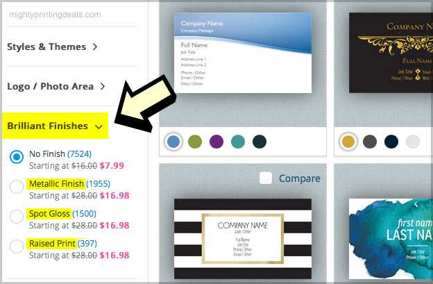
There are hundreds of designs that you can add these premium finishes too, so try choosing one to see the new search results.
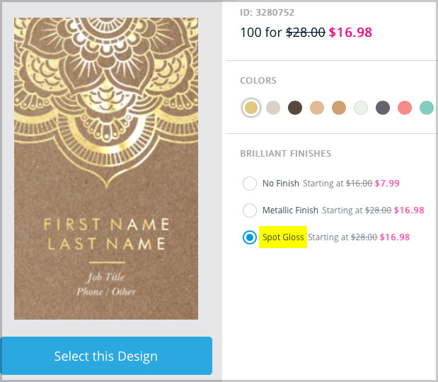
If you see a design you like, click on it. You’ll get a larger close-up, and the option to view with simulated finishes like this:
Witness the amazing impression that these shiny business cards have on the masses:
 Watch as your average Joe’s are blown away by Vistaprint’s spot gloss and metallic finishes. I don’t think their lives will ever be the same.
I think the shimmering shine of the business cards actually hypnotize the older man…
“Fish are dumb, dumb, dumb
They chase anything that glitters (beginners!)
Oh, and here they come, come, come
To the brightest thing that glitters…”
Metallic / Shimmering Foil Finish:
Here’s some inspiration and examples of business cards with Metallic finishes:
Spot Gloss Business Cards:
Examples of spot gloss business cards from Vistaprint. Add a touch of eye-catching “shine!”
Raised Print on business cards:
Raise your profile! (get it?)
Well, I hope that stock music doesn’t get stuck in your head, but even better; I hope you find the perfect business cards with eye-catching, shiny finishes.
*New:
Why you should still carry business cards

Vistaprint Promo Code 80% Off
[lltk-coupons]
- View all coupons (updated daily)
- Vistaprint Canada here
Vistaprint Promo Code 80-Off Discontinued?
*New: So, good things weren’t meant to last, as the vistaprint promo code for 80 off has not been renewed this month. The silver lining is that they are now offering a great deal for 500 business cards for $10 (plus shipping) which actually works out to be about the same price as the old “80% off” promotion.
Do you have thoughts on the newly discontinued 80-off deal? (Was it ever really 80% off?) Let us know with a comment below!

Vistaprint Banner Reviews: What Do Customers Say?
Vinyl banners from vistaprint.com: If you are looking to print custom signage of any kind, consider Vistaprint. They have become the most popular online printing service for small businesses and individuals because they are inexpensive and print quality products.

Vistaprint Brochures | New Coupon for a 20% Discount
Click below to take advantage of a promotion:
- Vistaprint Brochures: 20% Off – New customers also qualify for free shipping! – Ongoing
- More Vistaprint coupons
 – Check out today’s featured promotions to get the best price on brochures

A few of the hundreds of available brochure design templates
Cheap custom printed brochures from Vistaprint.com
If you are looking for inexpensive custom brochures, Vistaprint is among a handful of the discount online printing services that you should consider. You can easily search their design templates by industry, style, and theme, or upload your own complete design. Regardless of how you might use brochures, be sure to take advantage of a coupon for Vistaprint, giving you up to a 25% discount on your entire custom printing order!
While popular marketing materials like postcards and business cards can be effective marketing tools, brochures offer more space to develop and present an effective message and motivate potential customers.
So, how do you motivate people with a brochure? Start with a coupon
“Don’t find customers for your products, find products for your customers.” – Seth Godin
 If you’ve ever gone fishing, you’ll know that a good lure is crucial. Just like fish, people notice attention getting lures that are lively and colorful, and hidden on that lure is a sharp little hook. You have a product that your customers want, so lead with your offer.
Think of the front of your brochure as your two-second chance to get their attention. While stock photography and the promise of a “free consultation” will have your potential customers yawning, a time-sensitive coupon or offer might just motivate them to keep reading. Start with emotion, and then explain with supporting evidence that appeals to their logic. A typical 2-sided tri-fold brochure from Vistaprint gives you up to 6 panels to present and develop your message.
Brochures should give potential customers direction – a call to action
You have a fish on the line, but you still need to reel them in. At this point, tell them exactly what you want them to do next. Spell it out with a clear call to action. How should they immediately respond? Your customers should be encouraged to quickly pick up the phone, or visit your website. Don’t let them throw your brochure away or put it in a drawer, so make your call to action time-sensitive. “The first 200 customers get a free guide”, or maybe a $50 of coupon that expires next week.

These ridiculous brochures actually have a pretty good hook! (I’d pick one up)
Brochures are one of the most popular marketing tools for good reason
“The man who stops advertising to save money is the man who stops the clock to save time.” Think of brochures as a tool in your garage. Like your riding mower, it can be an expensive investment. While not appropriate for every job, brochures can be incredibly effective, offering significant return on your investment when used properly.
Use one of
our coupons
