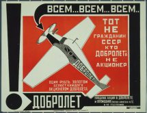
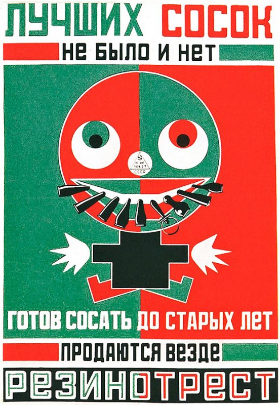
 Advertising and design ideas from Russian Constructivism: There are 101 ideas for why you might be printing flyers or posters: advertising a new restaurant, a clothing sale, a concert, or maybe a coupon for an oil change?
Regardless of the reason you are printing flyers, the objective is the same: get attention & convey your message.
Ideas for Flyer or Poster Design: Go Bold or Go Home!
So how do you get your message across on a busy street when 100 other businesses and brands are competing for the same people’s attention? Be bold and clear; and consider taking inspiration from Russian Constructivism.
Russian Constructivism Inspired Flyer & Poster Design:
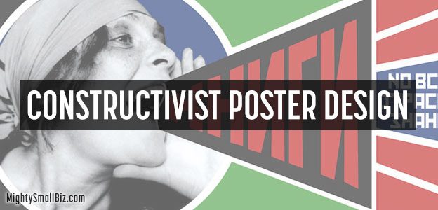
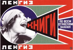
Soon after WWI a bold & abstract design style came out of Russia called “Constructivism.” It had the simple objective of getting people’s attention, and with minimal resources or technology, it soon became an effective style for both advertising and propaganda.
20% Off + Free Shipping on Flyers From Vistaprint: Get Coupon!
Constructivist design was constructed from visual elements like lines and planes in a precise, simple order. Often it looked like they used an exact-o knife (not Photoshop) as their main design tool.
Really, it was as if the message itself was cooked down to the basics, with all of the non-essential parts melting away.
Constructivist designers knew that people were used to seeing messages in the same way: from left to right, straight across the page; so why not rethink this basic unwritten rule?
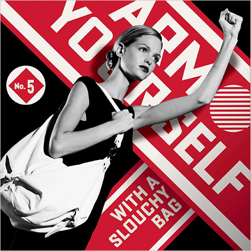
Factor in that in early 20th Century Russia the illiteracy rate was high; so advertisers knew that relying on paragraphs of words to convey their message wasn’t an option. They needed simple imagery to reinforce whatever was being said so the message was still received, even by those who couldn’t read.
Flyer and Poster Design Ideas: Less Is More
“Men of few words are the best men.” – William Shakespeare
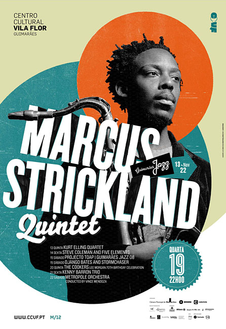
In all of our effort to convey a message, we have the tendency to over-complicate things. Whether we are teaching a lesson to a child, or advertising a restaurant, less is usually more. The essence of our message often gets lost in the excessive number of words and imagery that we use to deliver it.
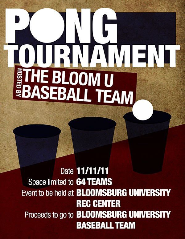


So, try reducing your message to it’s most simple form.
Sample: 2 Flyers / Posters for Bicycle Safety, Only 1 is Effective!
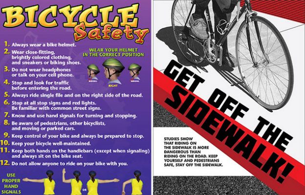
Ok, so this isn’t an “apples to apples” comparison, but you get the point. Give a quick look at both of these safety flyers. Ten minutes from now you might not be able to name even one of the ten rules of “bicycle safety,” but I guarantee you will remember the “stay off the sidewalk” message.
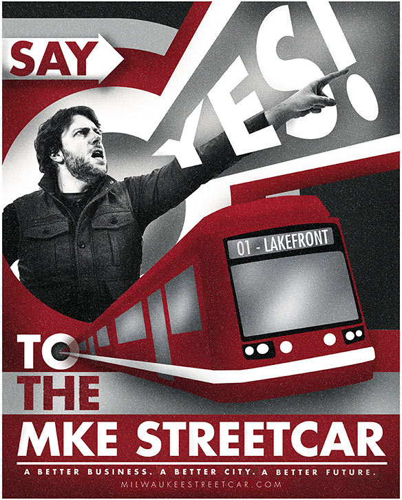
Check out these flyers for the same movie. Both of these flyers succeed in being simple and bold, but the one that adds a “Constructivist” twist seems to really grab and hold my attention.
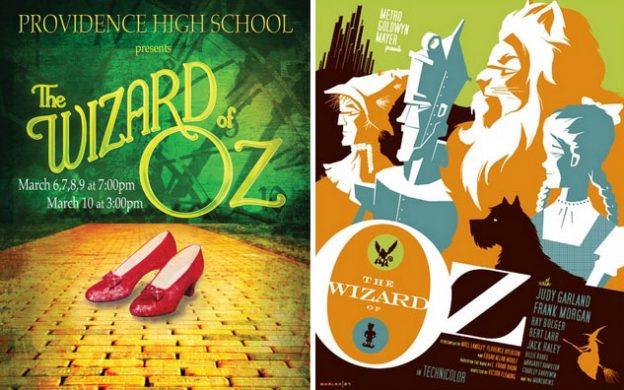
Printing Flyers or Posters: Can You Simplify Your Message?
Sure, you might not have a professional graphic designer or a big budget, but you still want to get noticed. Before printing your flyers, answer these questions:
- Does your flyer command attention and deliver your message instantly?
- Are all of the words you’re using really necessary, or could you cut them in half?
- Is your layout too predictable, with all of the copy running in rows from left to right?
- What if you rotated some of the words or design elements?
- If someone couldn’t read, would they know what your flyer is advertising?
Sample Constructivist Designs: Ideas for Flyers & Posters
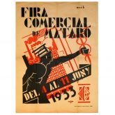
Check out some of these simple, eye-catching, bold examples of Constructivist advertising, and try envisioning your own message distilled to simple, bold fonts, copy, and imagery:
Flyers: Whether you’re printing something the size of a postage stamp or a poster, the goal is the same: get your message across. Flyers can do just that, so consider making them a part of your marketing strategy!
- Related: 12 Tips for Writing Press Release Headlines: From Gossip Magazines
- 4inkjets coupon: 15% off ink & toner

